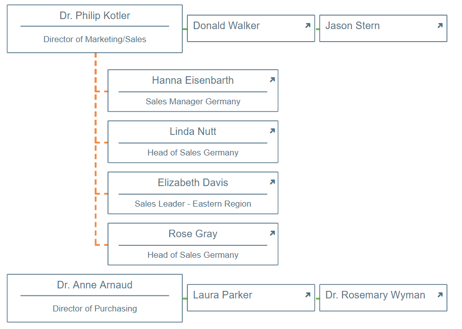
Custom org chart design
with org.manager
Organograms created with Ingentis org.manager are customizable, hence making it possible to meet nearly any requirement, including corporate design, HR analytics, functional relationships and many more.
After all, it’s your org chart!
There are several areas of your org chart you can customize with Ingentis org.manager. For one, this applies to the organogram’s design. Implement the number and positioning of views, box sizes, colors and logos you wish for – maybe according to your corporate design?
Further, you are free to integrate any kind of information into your organogram. Be it a dotted line to highlight a certain relation or important key figures to facilitate HR controlling. As long as the data is maintained in your data source, it can all be visualized.
Next to the content and design of your organizational charts, the user interface can also be adjusted according to your needs by adding e.g. a hierarchy tree, detail view, object list or freely editable elements.
Let’s have a look at some examples for your org chart design and content
Gain a quick overview of your organization’s structure
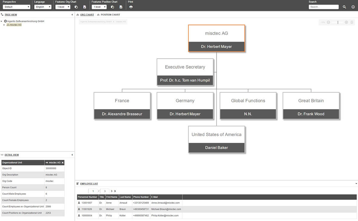
Click into this example, to see how organograms created with Ingentis org.manager provide you with a clean overview of your organizational structure and other employee related data. When accessing the demo at first, you’ll see only what is on level 1 of the hierarchy structure. Use the hierarchy tree on the left to easily navigate the org structure and click on the org units you are intesrested in to see the underlying structure. Don’t forget to adjust the number of levels you want see. This can be done in the task bar. In addition, use the task bar to select perspectives and languages. This is also where you’ll find the picture export as well as the print and search function.
Employee details
There are several ways to integrate employee details into your org chart. Of course, this also depends on the structure type you are using to visualize your organization. For example, if the objects displayed are only org units, you could add an employee list to your org chart view. In that case, one click on the respective object is all you need to reveal the linked employees and further details such as E-mail addresses. To see how this might look, click into the demo and select the “Default” view. Then click on one of the objects to see further details.
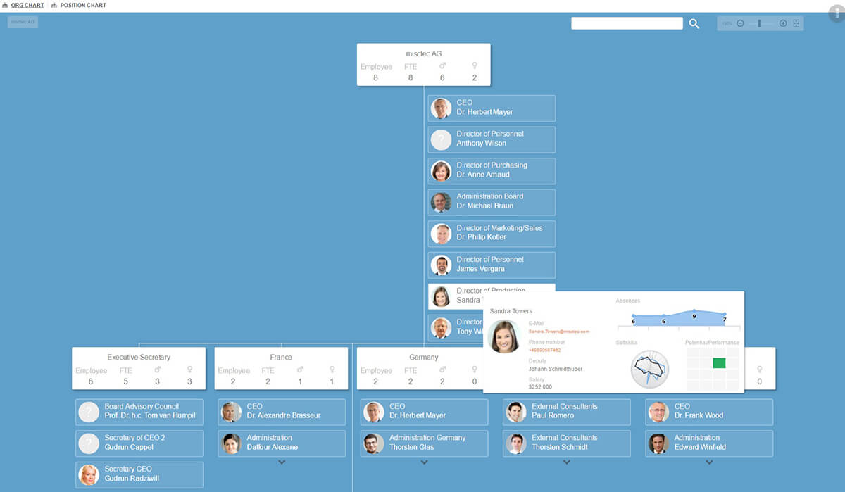
In case you are visualizing a structure that includes positions and employees, another way to provide additional information is to add a tooltip view. Open the demo and select the perspective “Structure with Details”. Now, click on any of the appearing employees to see a box with further personnel information.
The content of such employee details is always up to you. Of course, it needs to be maintained in your data source.
Visualization of HR analytics
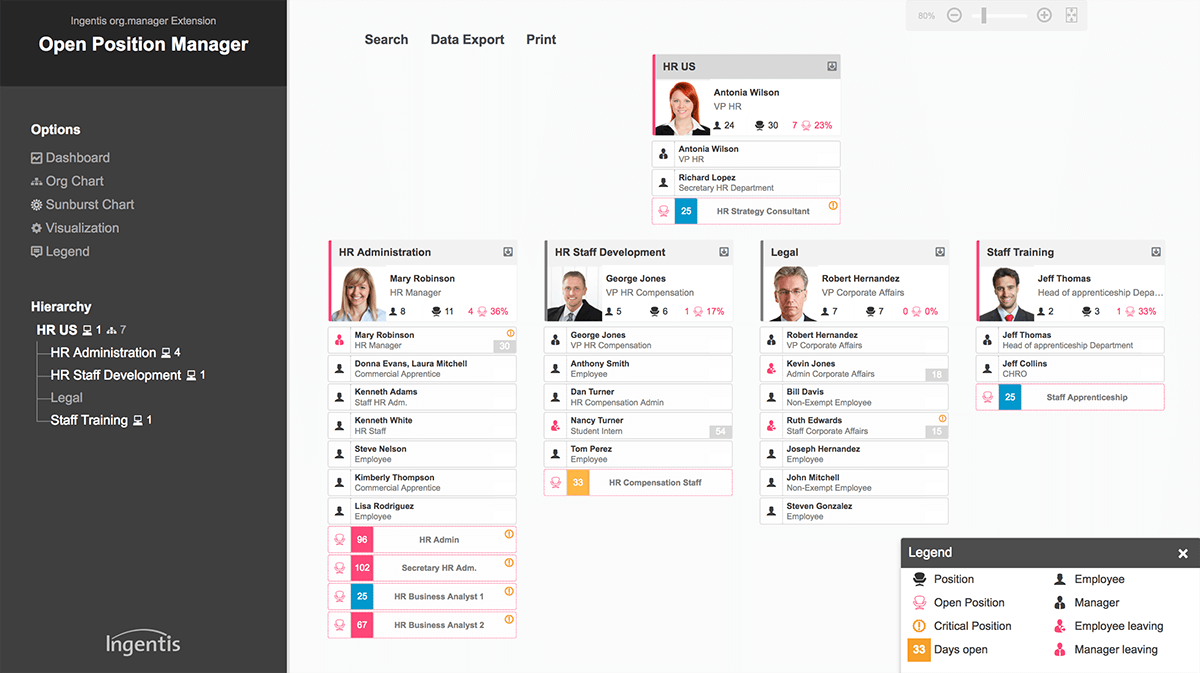
Keep track of important key figures by visualizing them as part of your organogram, as illustrated in the demo. One example can be seen in the perspective “Employee List” where the org units are presented together with figures such as headcount, percentage of vacancies or average age.
The perspective “Vacancies” shows how you can visualize your organizational structure when focussing on a single important key figure.
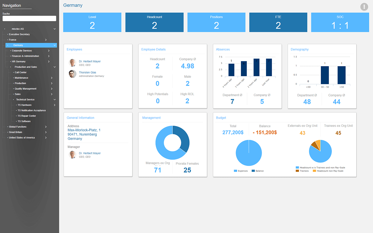
Next to a classical org chart, the perspectives ‘Dashboard’ and ‘Charts’ illustrate a different way of how to visualize structures and KPIs.
